
 Français
Uncategorized
Time to Refocus the Company Identity
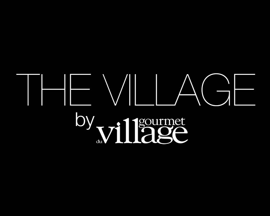
Introducing the ‘VILLAGE’ a new graphic look which will become the focus for us going forward. What is unique about ‘Gourmet du Village’?? that is the question we asked ourselves after 35 years.
Back in 1982 we started for just one season calling ourselves ‘Pot Pourri Village’ creating sachets of sweet smelling Pot Pourri, at that time we had just one package with spices for Mulling and Eggnog, our customers went crazy for the spice recipes and not as much for the Pot Pourri, it was an easy decision to change our name and the products we offered.
So Mike went back to the drawing board and with cut and paste, pen and ink, a bit of Lettraset, then followed up with multiple photocopies to make the image look more aged like a century old woodcut and created our ‘Lady Logo’ which we used for many years and which can still be seen on several of our Heritage products.
But times change, styles of design evolve and we realised our marketing needed to put more focus on our name ‘Gourmet Village’. in 2000 with the benefit of digital technology allowing for more stylised typography Mike came up with our ‘Signature’ logo which we still use to this day. You will find it proudly displayed on all of our packaging. The main focus was on the word ‘village’.
Now in 2017 after 35 years, it’s time to refocus. A new product focus, new recipes, new website, new look, the logical progression is to completely focus on our name ‘THE VILLAGE’. Our signature logo will remain, our company legal name will remain as ‘Concept Gourmet du Village Inc.’ but the unique marketing focus will become ‘THE VILLAGE’ supported by our signature logo. You will gradually see THE VILLAGE title on our catalogues, on our website, on our shipping boxes, business cards and all our corporate identity. We will focus on the values and virtues of THE VILLAGE, community, country values, caring, real people, a real place to call home, fresh, clean, pure produce, country markets.